Alternative Metrics for Latency Performance Monitoring
Systematically improving application performance involves two important dimensions. There is the objective fact — the hard numbers — which need to be explored in a high degree of detail in order to find root causes. Here, observability into the granular behavior of different components, effective logging and an appropriate visualization, are key.
Yet performance is also subjective. What is acceptable today may not be tomorrow, and what is acceptable in some contexts or to some customers is not acceptable to others.
In this blog post, I will show one way in to begin with user experience in order to keep track of application performance, using sample latency performance monitoring data from a prototype application at Loggly that uses Elasticsearch as the back-end.
Begin Understanding Application Latency Performance by Looking at User Experience
Users care about their experience with your service, not about latency per se. However, user feedback is hard to get, so we usually start with latency data. We often find that it follows a log-normal distribution — a long-tailed distribution which has a normal shape when plotted on a log scale. The average, mode and median are all different. Which one reflects adequately the user experience? The answer is: none!
Typically, users are frustrated when your service is slow but just satisfied when it performs well. All of these metrics, however, reflect a “happy medium” where users may or may not be satisfied. It is common, then, to use percentiles, for example, the 90th or 95th percentile, as a way to capture the experience of the users experiencing the worst performance.
While percentiles track the distribution of what is being measured (in our case, latency), they are not based on users’ perception of what is acceptable, which is why we need another metric.
Introducing the The Apdex Metric
The apdex metric, created by Peter Sevcik, is an industry standard for customer-centric performance metrics. It tries to capture users’ perception of when a request is satisfactory, tolerated or frustrating.
The concept is simple yet powerful: Select a latency threshold T below which users find performance satisfying and a threshold Y above which users get frustrated. Requests with latency between T and Y are just tolerated by users. The apdex metric finds the percentage of requests that satisfy users and adds half of the requests tolerated by users:
(Requests leaving users Satisfied + 50% of requests tolerated by users ) / Total Requests
How to select T and Y? Care must be avoided to fall into several traps when selecting thresholds — traps such as groupthink, HiPPO (the highest paid person’s opinion), etc. — and really make an effort to get both user feedback and empirical data. The metric T can be obtained from user feedback or direct observation. The metric Y can be gathered by inspecting log data to find the latency performance threshold that causes users to leave a web site or to press the search button more than once.
What if we can only find T or Y but not both? The apdex metric assumes Y = 4 * T, so you can estimate the missing value from the the other. If you do not have any data or user feedback, a good starting point is T = 4 seconds, according to the Apdex Alliance (www.apdex.org).
On the other end of the spectrum, if you find the apdex formula too generic, you can establish threshold T and Y for different services and/or customer segments and calculate a compound metric.
When Fast Queries are Bad
Fast queries are not always desirable. With our prototype app, we tried a couple of different configurations, showing the following latency distributions as reported by Elasticsearch (users would face slightly higher times given network latency):
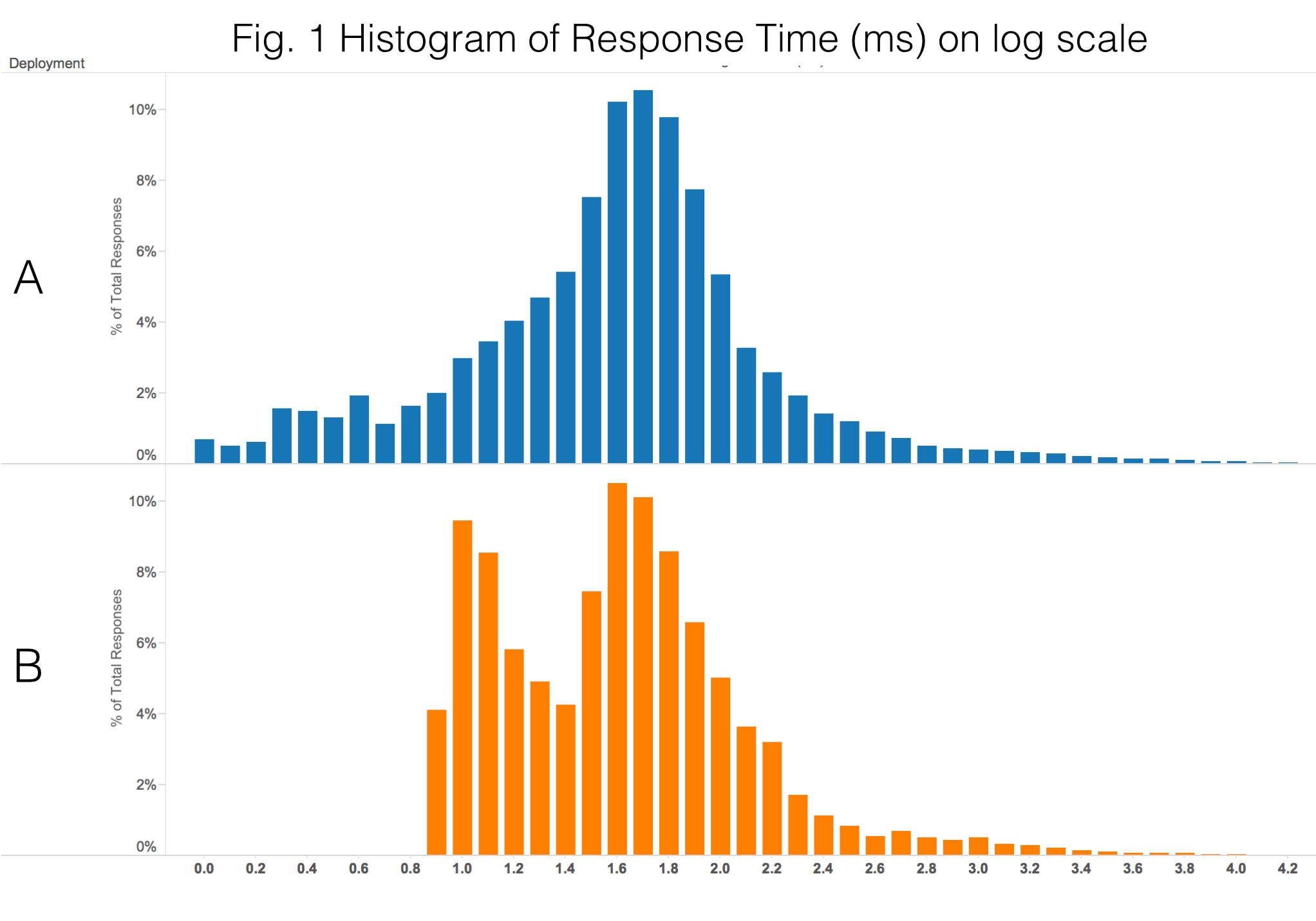
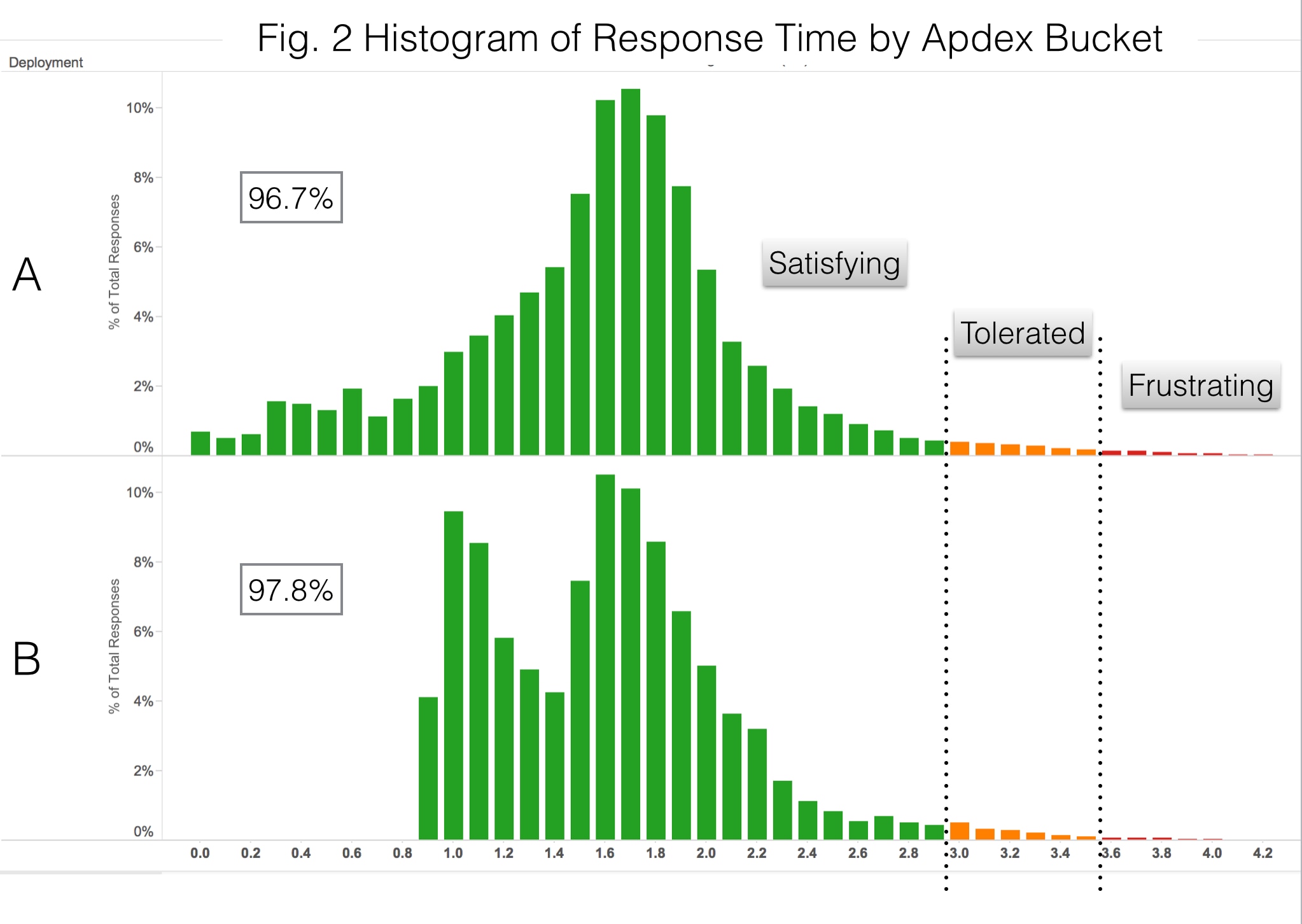
It would appear that A is more desirable, because a portion of its queries are blazingly fast. However, some of its queries are very slow as well. It turns out that B gives users a better experience as evidenced by the apdex metric. Using T = 1 sec, the apdex metric for configuration A is 96.7% whereas for B it is 97.8% – slightly better. Here are the same histograms as above, color coded for the apdex bucket:
Using the Apdex Metric as a KPI
DevOps personnel track many performance metrics, but few of these get upper management attention. Some operational metrics, however, can also become key performance indicators (KPIs). All KPIs are metrics, but not all metrics are KPIs.
In a cloud-based business, the user experience with the service is fundamental. So let us test the apdex metric against three criteria proposed by Jonathan Becher[1] to see whether it merits being incorporated as a company-wide indicator:
- Outcome-oriented: Tied to an objective, for example, improving customer satisfaction.
- Target-based: Have at least one time-sensitive target value defined, for instance, a milestone date for achieving a given performance improvement.
- Rated or graded: Have explicit thresholds that grade the difference (or gap) between the actual value and the target.
When tracking a service which is critical to your company, the apdex metric definitely meets the above criteria. The question now is how to gather the data and report it. If your executives already have a dashboarding system where they track other KPIs—financial, organizational, competitive, etc.—then it makes a lot of sense to grab operational metrics from your log management system and feed that information into your executive Business Intelligence tool. If you don’t have a dashboarding system in place, you can use Loggly to build and expose those metrics.
In my next blog post, I will show how to extract data from Loggly to calculate the apdex metric and feed the information into an operational dashboard in Loggly or your BI tool of choice using a Python script.
In the meantime, don’t forget about tomorrow’s (12/11/14) VentureBeat webinar at 9:30 a.m. PST, featuring me and some data scientists including Bruno Aziza (CMO, Alpine Data Labs), Brad Shimmin (Principal Analyst, Current Analysis), and June Andrews (Senior Data Scientist, LinkedIn). Register to join in on a great discussion about putting big data to practical use.
Notes
[1] Mitigating Metrics Madness: How to Tell KPIs from Mere Metrics, Jonathan Becher, 2006. [From Cutter IT Journal Vol. 19 No. 4, April 2006, pp13-16]
Further Reading
- Loosley, Chris. “Apdex as a (Key) Performance Indicator.” Apdex Alliance.
- Volodarsky, Mike. “Why Average Latency Is a Terrible Way to Track Website Performance … and How to Fix It.” Mike Volodarsky’s Blog.
Application performance management vendors have different opinions regarding the apdex metric:
- Kayser, Bill. “Breaking Down Apdex.” New Relic.
- Hirschauer, Jim. “Apdex Is Fatally Flawed.” AppDynamics.
The Loggly and SolarWinds trademarks, service marks, and logos are the exclusive property of SolarWinds Worldwide, LLC or its affiliates. All other trademarks are the property of their respective owners.

Mauricio Roman